Office Paint Colors: Choosing Based on Your Spaces, Brand, and Teams
When it comes to renovating or designing offices, color is often relegated to the background behind furniture or lighting. However, several studies in environmental psychology show that the visual environment influences mood, attention levels, and certain forms of work performance. Conversely, entirely white spaces are regularly associated with more boredom, monotony, and lower cognitive stimulation.
So, which color should you choose for your offices? How can you create spaces that promote concentration, reflect your brand identity, and enhance employee well-being?
In this guide, LES BATISSEURS explain how to build a coherent palette from A to Z.
Color Psychology in the Office
Color psychology in the office is an excellent starting point, but it should never be interpreted simplistically. A color never acts alone: its effect depends on its hue, brightness, saturation, natural light, and cultural context.
In other words, a powder blue will not have the same impact as a deep navy blue. Similarly, a slightly desaturated brick red can be warm and elegant, whereas a highly saturated primary red can become aggressive on large surfaces.
Major Color Families and Their Effects
| Color | Generally Observed Effects | Recommended Spaces |
|---|---|---|
| Blue | Concentration, calm, stability | Open spaces, individual offices |
| Green | Balance, soothing, connection to nature | Break areas, collaborative zones |
| Yellow | Energy, creativity, optimism | Brainstorming rooms |
| Orange | Dynamism, conviviality, exchange | Reception, informal spaces |
| Red | Intensity, stimulation, urgency | Accent touches only |
| Terracotta | Warmth, authenticity, conviviality | Reception, cafeteria |
| Neutral Tones | Elegance, sobriety, versatility | All spaces |
Research on work environments also shows that cool colors, particularly blues and greens, are generally perceived as more conducive to concentration than highly stimulating shades.
Beware of Cultural Generalizations
Color psychology varies across cultures. White symbolizes purity in the West but mourning in several Asian cultures. Orange can evoke creativity in Paris but appear low-end in other contexts. When your teams are multicultural, which is often the case in Paris, it is better to test color combinations with a few employees before finalizing a definitive palette.
Total White: The Color to Banish?
White remains omnipresent in French offices. However, the “all-white” look is now showing its limits. While it visually expands the space, it can also create an impression of coldness, uniformity, and a lack of personality. Specialized manufacturers like Little Greene recommend pairing it with tinted whites, beiges, or accent colors to create more visual depth.
The real question is therefore not which color is best, but which color combination is most suitable for your activity, your teams, and your spaces.
Which Color to Choose for Each Area of the Company?
The best color for a professional office depends primarily on the use of each zone.
Open Space: Promoting Concentration
In an open space, the main objective is to support sustained attention.
The most relevant colors are:
- Light blue or grayish blue
- Teal used as an accent wall
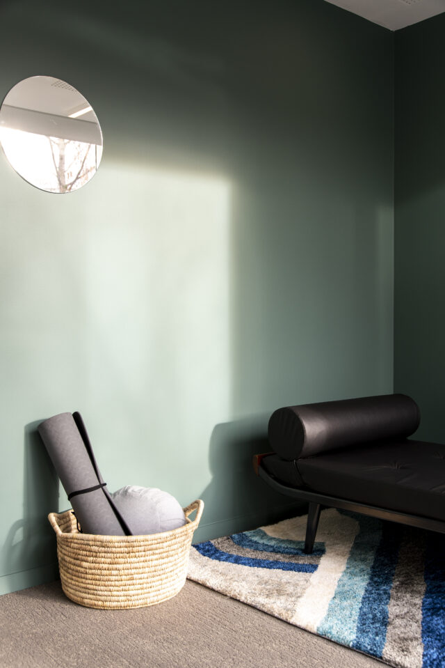
- Sage green
- Soft, slightly desaturated green
Conversely, a dominant red can increase visual stimulation and become tiring when used on large surfaces.
Meeting Room: Stimulating Exchanges
The meeting room must encourage decision-making and collaboration.
Effective combinations:
- Stimulating blue to structure exchanges
- Soft yellow to promote creativity
- Subtle orange to encourage participation
The goal is to achieve a balance between energy and concentration.
Reception Area: Nailing the First Impression
The reception area is often the first physical contact with your company.
The most commonly used shades:
- Terracotta
- Earthy orange
- Warm beige
- Sand
These colors immediately create a sense of conviviality and hospitality.
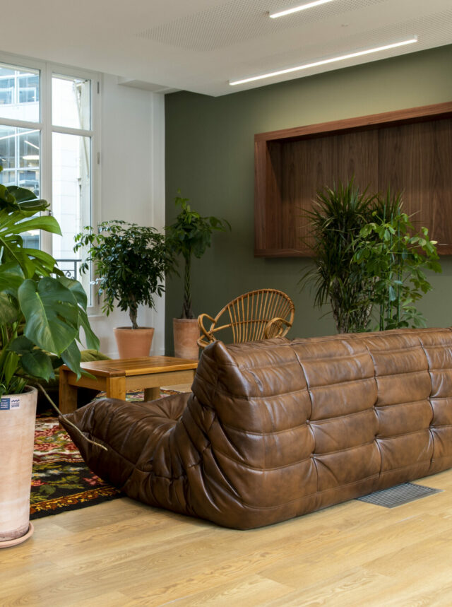
Break Area and Kitchen
The break areas should break away from the work atmosphere.
Current trends favor:
- Sage green
- Forest green
- Terracotta tones
- Natural tones paired with wood
Adding plants further reinforces this sense of well-being.
Individual Offices and Concentration Zones
For spaces requiring a high level of concentration:
- Neutral shades
- Warm grays
- Off-white
- Mineral beige
A discreet accent color can be added behind the workstation or on a section of the wall.
The Simple Rule to Remember
For each space:
- One dominant color
- One accent color
- Complementary materials
This approach avoids the “color catalog” effect often seen in offices renovated without a global vision.
From Your Logo to Your Walls: How to Integrate Your Brand Identity Without Falling Into the Trap
Many companies want to use their brand identity colors in their offices. The intention is excellent, but the execution is often problematic.
A Pantone or RAL color designed for a logo is not necessarily suitable for a wall surface of several dozen square meters.
Why?
Because:
- Perceived intensity changes with the size of the surface.
- Artificial light modifies the rendering.
- Materials absorb or reflect color differently.
The task, therefore, is to translate the brand identity into a space.
For example:
- A corporate blue can become a grayish blue.
- A logo red can be transformed into terracotta.
- A bright green can evolve into a more sophisticated sage green.
The Three Most Frequent Mistakes
1. The giant logo painted on an entire wall
The effect is often dated and visually aggressive.
2. Saturated primary colors everywhere
They quickly tire the occupants.
3. A total lack of coherence between spaces
Each room adopts a different color without an overall logic.
This is precisely where the intervention of an interior architect or an office fit-out specialist in Paris makes sense: transforming a visual identity into a coherent spatial experience.
Beyond the Walls: Color as a Global Decision
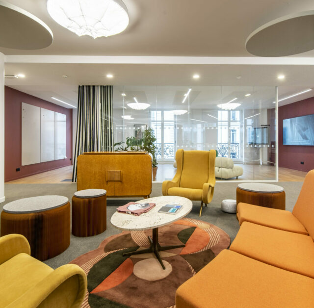
A frequent mistake is reducing the color strategy to paint alone.
However, the true palette of a professional office includes:
- The walls
- Colored furniture
- Partitions
- The floor coverings
- The signage
- Lighting fixtures
- Plants
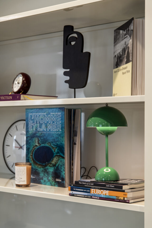
- The decoration
The coherence of color + furniture + signage is today one of the most visible markers of successful offices.
Finishes That Make the Difference
Matte Paint
- Sober and elegant appearance
- Ideal for executive spaces
- Highly appreciated for its high-end rendering
Satin Finish
- More durable
- Easier to maintain
- Suitable for open spaces and high-traffic areas
At LES BATISSEURS, this systemic approach allows for the construction of a true global color strategy for the premises, where each element contributes to the identity of the place.
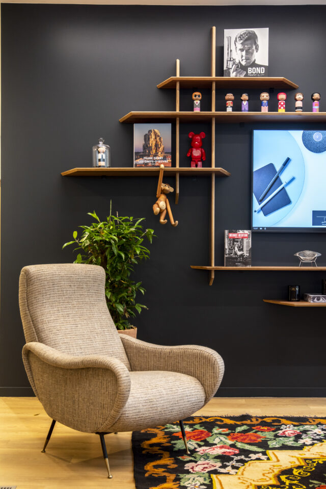
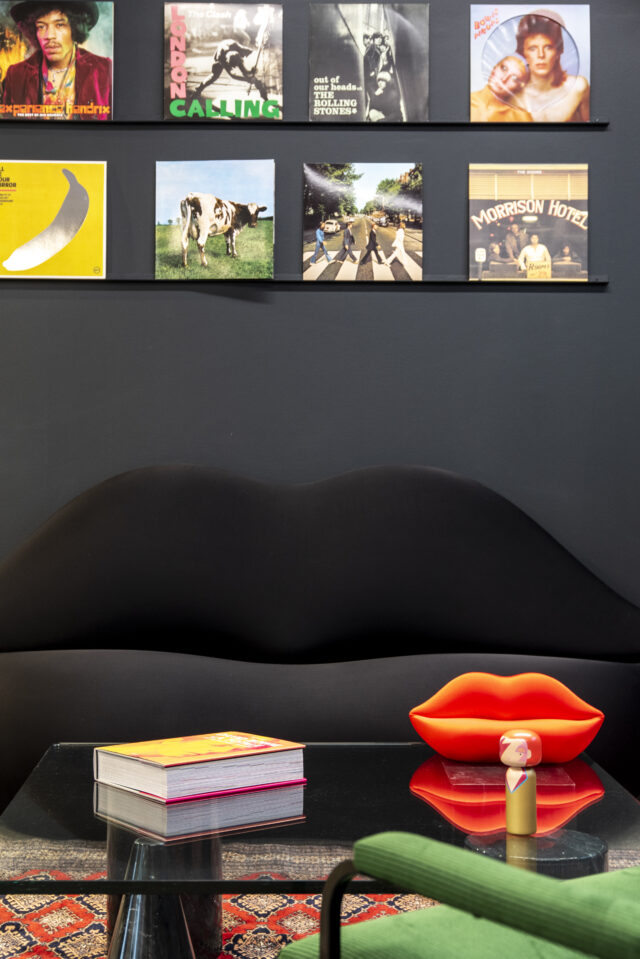
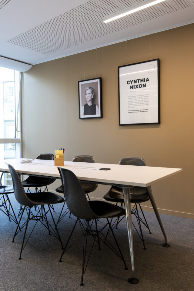
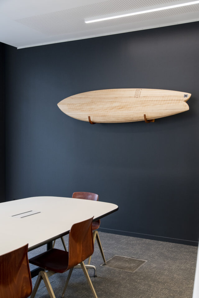
Colors and Employer Brand: Your Offices Also Speak to Your Future Talent
Today, offices have become an HR tool.
During an interview, a candidate unconsciously observes:
- The general atmosphere
- The level of care given to the spaces
- Visual coherence
- Quality of life at work
An inspiring environment sends a strong signal: the company invests in the well-being of its employees.
This perception influences:
- Talent attraction
- The onboarding experience
- The sense of belonging
- Retention
Studies on Quality of Life at Work (QLW) provide concrete data: according to research from the University of Texas, an environment with well-chosen colors can increase employee creativity by up to 30%. Conversely, working in white or gray spaces increases sadness by 25% and reduces energy levels by 30%—directly impacting productivity. More broadly, Gallup studies show that highly engaged employees generate +17% productivity and +21% profitability for their company. A well-thought-out space, colored with intention and coherence, reduces turnover and facilitates onboarding: newcomers take ownership of a space with a strong visual identity more quickly.
LES BATISSEURS systematically integrate this angle into every office design project. Defining the color palette is part of the strategic phase, just like the floor plan or the choice of furniture. The goal: for the space to become an attraction factor, not just a functional setting.
Office Color Trends 2026: What We Are Observing on Our Parisian Sites
As an office fit-out specialist in Paris, we are seeing several strong developments.
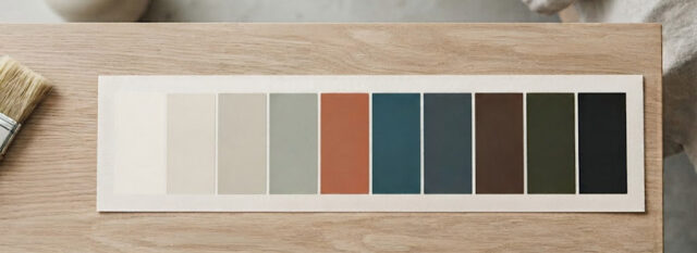
Terracotta is Establishing Itself
Terracotta and earthy tones are gradually replacing cold grays.
They bring:
- Warmth
- Elegance
- Character
The Return of Deep Greens
Companies are seeking more connection with the living world.
The most requested shades:
- Bottle green
- Forest green
- Dark sage green
The Sage Green + Natural Wood Duo
This is currently one of the most popular combinations for integrating biophilia principles into workspaces.
Teal Remains a Safe Bet
Particularly in startups and technology companies.
Pure White is Receding
Off-whites, linen, sand, and eggshell are taking over.
They maintain brightness while creating warmer environments.
On several projects conducted for leading companies like Brevo or Vestiaire Collective, we observe this same desire: to abandon standardized office codes in favor of palettes that are more human, more differentiating, and more aligned with corporate culture.
Do You Want to Define Your Office Color Palette?
LES BATISSEURS support companies in designing coherent, high-performing offices aligned with their brand identity, from the choice of colors to the complete layout of spaces, as well as in office renovation.
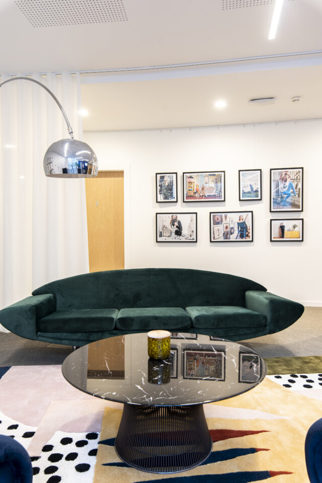
Questions About Office Paint Colors
What is the best paint color for a professional office?
There is no universal color. Blues and greens are often preferred for concentration, while warm shades promote exchange and conviviality.
Should all walls be painted the same color in an open space?
No. It is generally preferable to work with a dominant color and one or more accent walls to visually structure the space.
How should brand identity colors be used in offices?
The best practice is to adapt brand colors to architectural constraints rather than reproducing them identically.
Which paint finish should be chosen for offices?
Matte paint offers an elegant look. A satin finish is more durable and suitable for high-traffic areas.
Can several colors be mixed in offices without it looking messy?
Yes, provided a coherent palette is built around a mastered color wheel, with a clear hierarchy between dominant, secondary, and accent colors.
You Might Also Like These Articles
Learn More
How to improve employee well-being at work?
The health crisis has reshuffled the deck for corporate work. Remote work, flexibility, office layout, individual space, eco-responsibility… the corporate world has had to adapt…
Learn More
Biophilia Contributes to Well-Being at Work
At a time when companies are more aware than ever of the physical, psychological, and social effects of the work environment, it is surprising to…